User flow & User journey
January 11, 2024
1 min
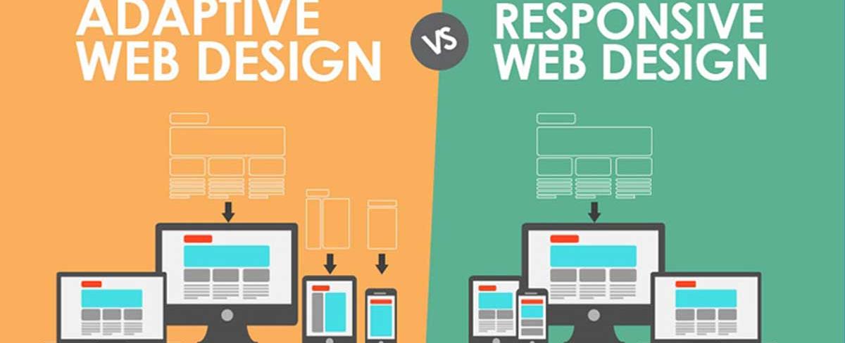
In its simplest definition, responsive design uses just one layout for a web page and “responsively” adjusts to better fit the user’s screen, whether it’s a desktop, a laptop, a tablet, or a mobile phone.

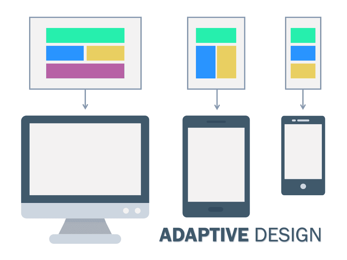
In layman’s terms, adaptive design creates different fixed layouts that adapt to specific screen sizes. In short, you have multiple versions of a web page to fit someone’s device, as opposed to a single, static page which looks the same (and reorders or resizes content) across all devices.

Quick Links
Legal Stuff
Social Media
