WPF Basic Controls
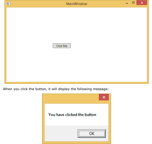
Button
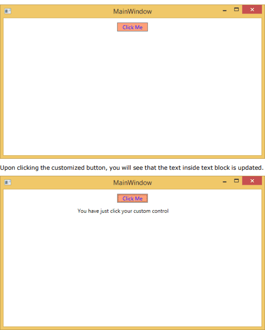
The Button class represents the most basic type of button control
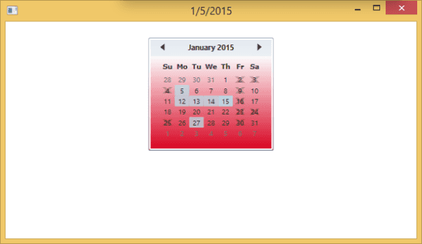
Calendar
Calendar is a control that enables a user to select a date by using a visual calendar display. It provides some basic navigation using either the mouse or keyboard. The hierarchical inheritance of Calendar class is as follows
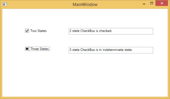
Checkbox
A checkbox is a control that a user can select (check) or clear (uncheck). It provides a list of options that a user can select, such as a list of settings to apply to an application. The hierarchical inheritance of Checkbox class is as follows:
Combobox
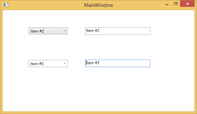
A combobox is a selection control that combines a non-editable textbox and a drop-down listbox that allows users to select an item from a list. It either displays the current selection or is empty if there is no selected item. The hierarchical inheritance of ComboBox class is as follows:
Command
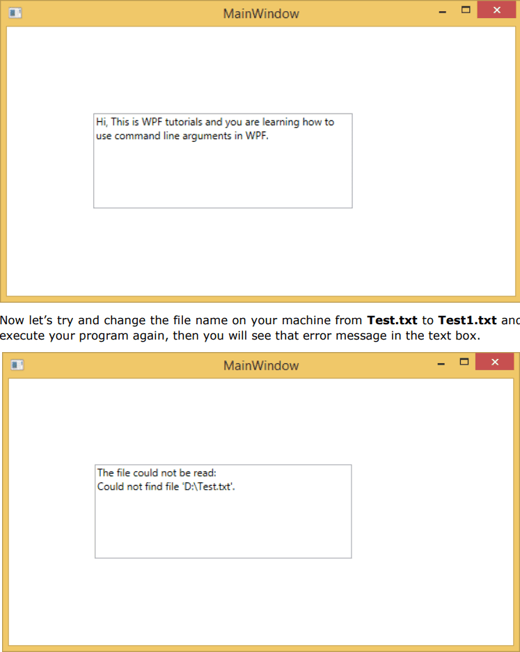
Command line argument is a mechanism where a user can pass a set of parameters or values to a WPF application when it is executed. These arguments are very important to control an application from outside, for example, if you want to open a Word document from the command prompt, then you can use this command “C:> start winword word1.docx” and it will open word1.docx document.
Command line arguments are handled in Startup function. Following is a simple example which shows how to pass command line arguments to a WPF application. Let’s create a new WPF application with the name WPFCommandLine.
ContextMenu
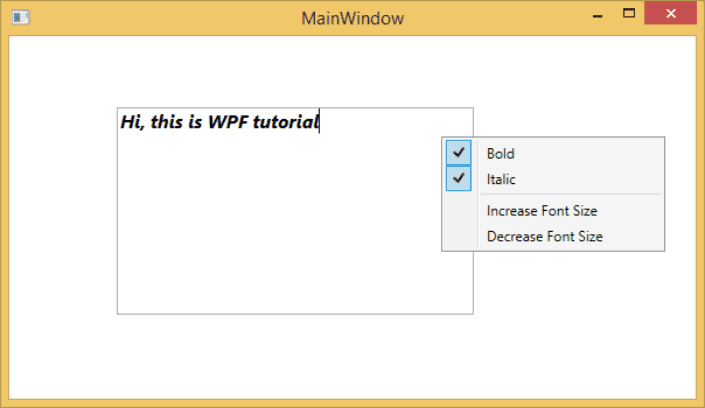
ContextMenu is a pop-up menu that enables a control to expose functionality that is specific to the context of the control. It appears whenever the context menu is requested through a user interface from within this element. The hierarchical inheritance of ContextMenu class is as follows:
Custom Controls
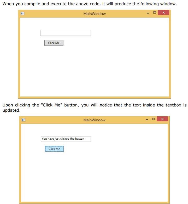
A custom control is a class which offers its own style and template which are normally defined in generic.xaml. Custom controls are used in the following scenarios
If the control doesn’t exist and you have to create it from scratch.
If you want to extend or add functionality to a preexisting control by adding an extra property or an extra functionality to fit your specific scenario.
If your controls need to support theming and styling.
If you want to share your control across applications
User Control
User Controls provide a way to collect and combine different built-in controls together and package them into re-usable XAML. User controls are used in following scenarios:
If the control consists of existing controls, i.e., you can create a single control of multiple, already existing controls.
If the control doesn’t need support for theming. User Controls do not support complex customization, control templates, and difficult to style.
If a developer prefers to write controls using the code-behind model where a view and then a direct code behind for event handlers.
You won’t be sharing your control across applications.
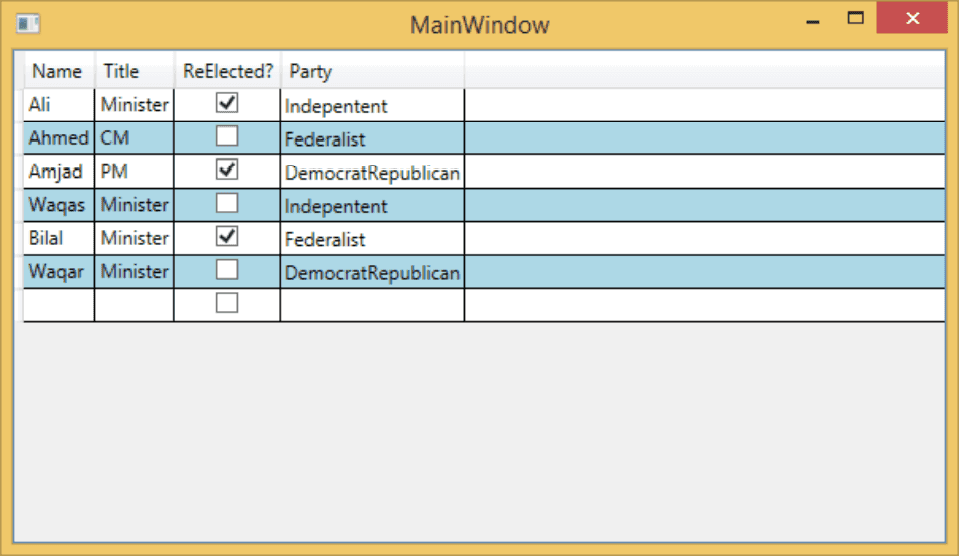
DataGrid
A DataGrid is a control that displays data in a customizable grid. It provides a flexible way to display a collection of data in rows and columns. The hierarchical inheritance of DataGrid class is as follows:
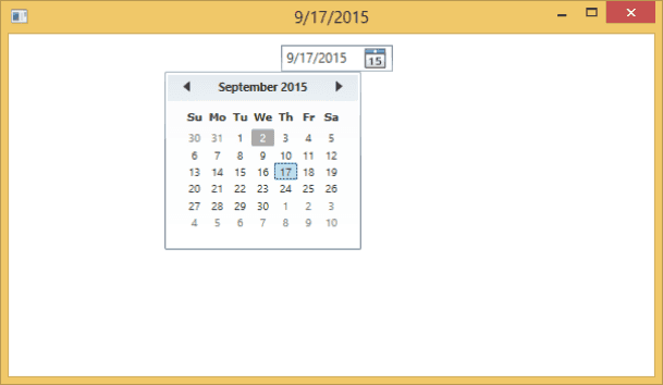
DatePicker
A DatePicker is a control that allows a user to pick a date value. The user picks the date by using ComboBox selection for month, day, and year values. The hierarchical inheritance of DatePicker class is as follows:
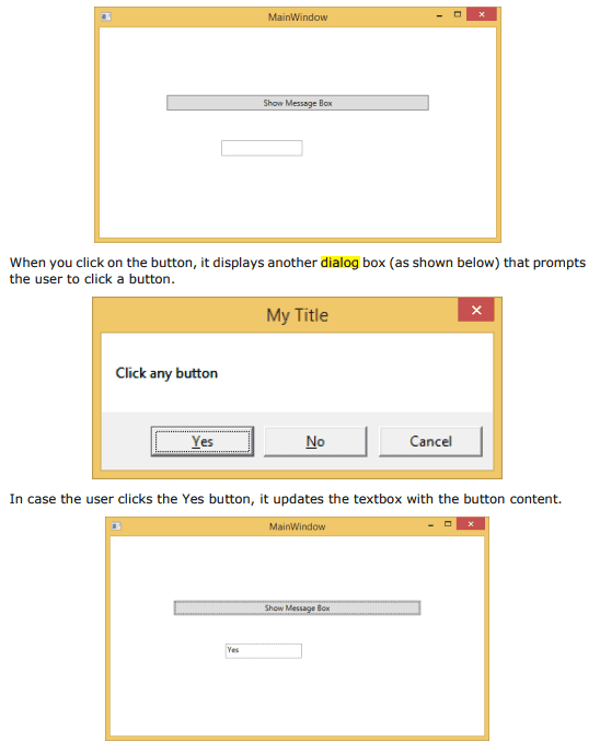
Dialog Box
All standalone applications have a main window that exposes some functionality and displays some data over which the application operates through a GUI. An application may also display additional windows to do the following:
- Display some specific information to users
- Gather useful information from users
- Both display and gather important information
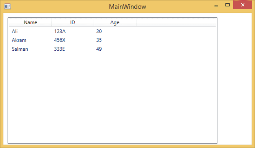
GridView
A GridView is a control that displays data items in rows and columns. Actually a ListView displays data. By default, it contains a GridView. The hierarchical inheritance of GridView class is as follows:
Image
A control that displays an image, you can use either the Image object or the ImageBrush object. An Image object display an image, while an ImageBrush object paints another object with an image. The image source is specified by referring to an image file using several supported formats. It can display the following formats;

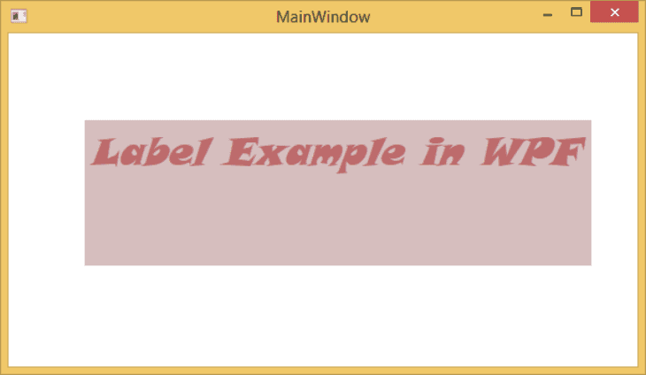
Label
The Label class provides both functional and visual support for access keys (also known as mnemonics). It is frequently used to enable quick keyboard access to controls. The hierarchical inheritance of Label class is as follows:
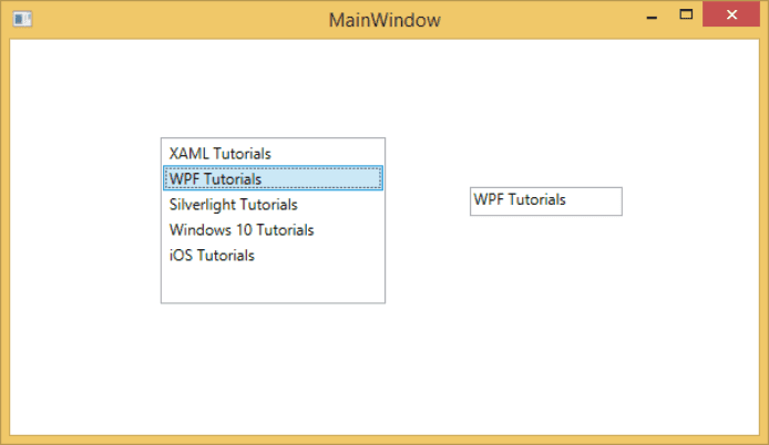
ListBox
ListBox is a control that provides a list of items to the user item selection. A user can select one or more items from the predefined list of items at a time. In a ListBox, multiple options are always visible to the user without any user interaction. The hierarchical inheritance of ListBox class is as follows
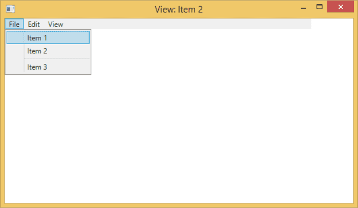
Menu
Menu is a control that enables you to hierarchically organize elements associated with the commands and event handlers. Menu is an ItemsControl, so it can contain a collection of any object type such as string, image, or panel. The hierarchical inheritance of Menu class is as follows:
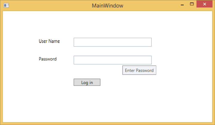
PasswordBox
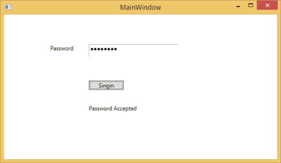
PasswordBox is a control that allows the user to enter masked passwords. When the user enters a password, it will be displayed as password characters. You can change the Password character by setting the PasswordChar property. The hierarchical inheritance of PasswordBox class is as follows:
Popup
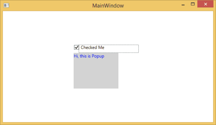
Popup is a control that displays content on top of existing content, within the bounds of the application window. It is a temporary display on other content. The hierarchical inheritance of Popup class is as follows:
ProgressBar
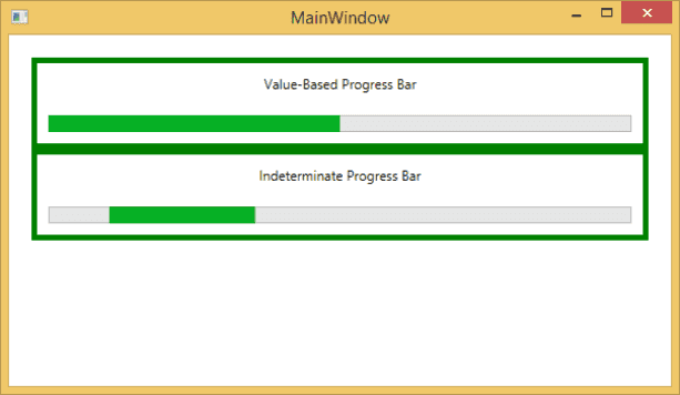
ProgressBar is a control that indicates the progress of an operation, where the typical visual appearance is a bar that animates a filled area as the progress continues. It can show the progress in one of the two following styles:
Radio Button
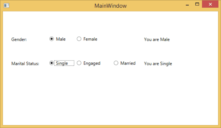
A Radio Button is a control that allows a user to select a single option from a group of options. The user is limited to select a single option from a related list of options which are mutually exclusive. It has only two options;
- Selected
- Cleared
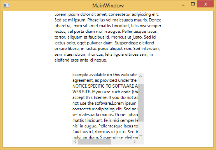
ScrollViewer
A ScrollViewer is a control that provides a scrollable area that can contain other visible elements. The hierarchical inheritance of ScrollViewer class is as follows:
Slider
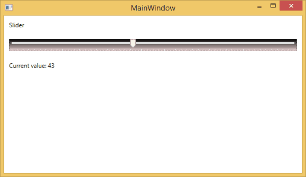
A slider is a control with the help of which a user can select from a range of values by moving a Thumb control along a track. The hierarchical inheritance of Slider class is as follows:
TextBlock
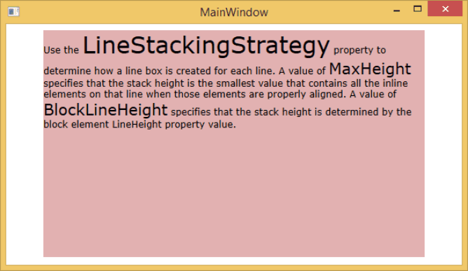
A TextBlock is a lightweight control for displaying small amounts of read-only text. The hierarchical inheritance of TextBlock class is as follows:
Toggle Button
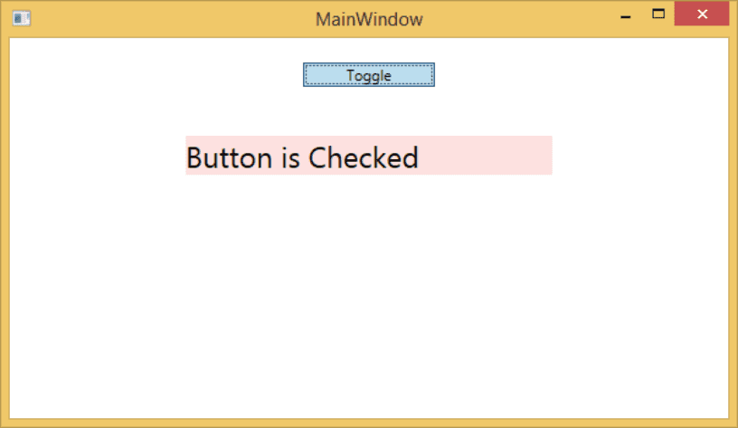
A Toggle Button is a control that can switch states, such as CheckBox and RadioButton. The hierarchical inheritance of ToggleButton class is as follows:
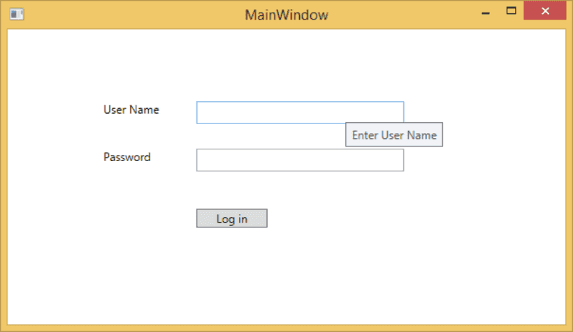
Tooltip
A tooltip is a control that creates a pop-up window that displays information for an element in the GUI. The hierarchical inheritance of ToolTip class is as follows:
Window
Window is the root window of XAML applications which provides minimize/maximize option, title bar, border, and close button. It also provides the ability to create, configure, show, and manage the lifetime of windows and dialog boxes. The hierarchical inheritance of Window class is as follows:
Tags
Share
Table Of Contents
Related Posts
Quick Links
Legal Stuff
Social Media
